
Ehryn Torrell
Nocturne: Art at Night Festival
Halifax
October 19, 2013
Ehryn Torrell’s My Mother’s Alphabet is a series of objects and gestures that were presented over six hours during Halifax’s Nocturne festival. Using obsolete forms of communications technology, the artist attempted to reconcile deep personal loss through a symbolic bridging of language and temporal distance. The project takes, as itspoint of departure, the last letter that the artist’s late mother wrote to her. The nature of the project is profoundly intimate, and its realization —part installation, part performance, part industrial design and part social collaboration— was quiet and stark.
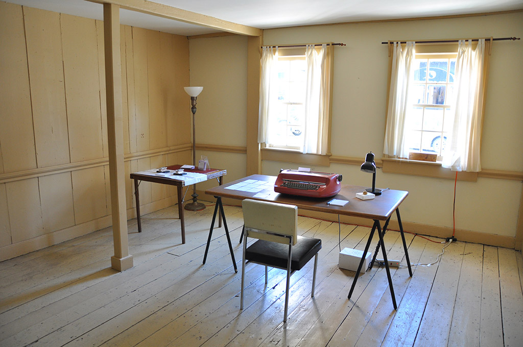
For Nocturne, My Mother’s Alphabet was presented in the restored 18thC Quaker House in Dartmouth, across the harbour from Halifax’s downtown core. I generally find house museums to be an unsettling combination of domesticity and didacticism; the echoes of daily life competing for attention in rooms full of names, dates and artefacts. However, as a backdrop for Torrell’s project the site was a seamless choice. The various elements of My Mother’s Alphabet are infused with an inescapable sense of absence that is heightened by the contrasting, concrete qualities of text and object.
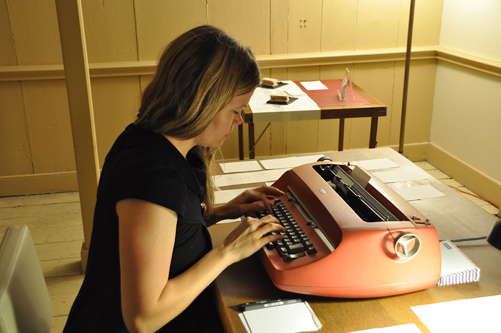
The piece centres on a 1960s IBM Selectric typewriter, distinctive for its use of a single typeball, comprising all letters and characters, which pivots rapidly to strike the page. The artist worked with Scottish 3-D design firm Dotsan to develop a typeball that would produce a font based on her mother’s handwriting. The resulting custom font is missing the lowercase j, q and x and contains only a small number of capital letters, as the author of the original letter could never have known that this piece correspondence would form the basis of a writing instrument. This subtle detail, once realized, is a powerful reminder of the futility of language to express the depth and complexity of human experience.
Selectric typeballs are complicated objects, and Torrell’s custom versions reveal a number of problems. The nylon prototypes do not yield crisp letters, and the cast brass version is too heavy for the machine’s swift action. Furthermore, the expressive nature of cursive writing does not lend itself readily to the tight tracking of the monospaced ball. Seated at a desk in the centre of the room for most of the evening, Torrell tapped out simple words on the typewriter, each three or four letters long: tree, bet, life. Through this ritual, she attempted to form legible words, “something that I could read and recognize as authentic handwriting.” When the artist generated a word that she felt was legible, she circled it and visitors who read the circled words aloud were given the page to take away.
Other elements of the project included a poster tacked to the wall displaying the custom font, a set of two font stamps where visitors were invited to make impressions on blank postcards (the fonts on these objects are also derived from letters written by the artist’s mother, this time two love-letters written 36 years apart), and a stack of out-of-print UK Air Mail envelopes each containing a slip of paper marked with the words “It really did help,” the last line of her mother’s final letter. These last two components–variations on the artist multiple – were offered to visitors freely, a gesture that mirrors the generosity of the phrase.
My Mother’s Alphabet attempts to resolve two seemingly conflicting scenarios: the possibility of reproducing what is both physically and metaphorically irreproducible; and from that implausible position, the possibility of creating honest, tangible and intimate moments of human contact. The resulting tension — between the personal and the mechanized, intimacy and distance—provided one of the most poignant experiences of the festival.

